Streamlining all post-booking features for easy maintenance
AirAsia.com
2022
The post-booking experience with AirAsia lacked cohesion, requiring users to navigate through disparate pages and entry points in order to manage their bookings—whether for cancellation, rescheduling, or adding additional features.
The objective is to streamline all entry points, reducing maintenance and operational costs, while enabling users to perform self-service flight changes and maintain a seamless user experience.
The data and confidential information in this case study has been altered to comply with non-disclosure agreement. All information in this case study is my own and does not necessarily reflect the views of AirAsia.

My role
Collaborated with all stakeholders include PMs and business teams.
Conceptualized design ideas.
Created a research plan, conducted user interviews, concept testing, synthesized.
Designed based on research findings.
the team
1 designer
1 researcher
2 product managers
duration
2 Weeks
Why redesign?
Post-booking experience in AirAsia was a feature that overlooked for quite sometimes and not maintained because of the cost. The feature itself divided into three: add-ons, refund, and reschedule.
When the COVID-19 pandemic hit and numerous flights were canceled and rescheduled, the team began to notice that the processes for managing these changes were disjointed.
01.
Passengers with canceled flights only received notifications via email
Email is proven to be ineffective to use as announcement channel for urgent matter as users rarely check their emails. Therefore this method lacked crucial information about their disrupted travel plans.
02.
Refund for canceled flight can only be done through customer service
The only way to request for refund for canceled flight was through AVA, AirAsia customer service. but this method proved ineffective and led to more passenger complaints.
03.
Voluntary reschedule and refund can be done on AirAsia app & web
Although refund for canceled flight can be done only via customer service, voluntary reschedule and refund can be done through app and web meaning the two feature are built and maintained differently and it caused costs for the company
The challenge
Multiple stakeholders with different agenda
For this project I had to work with two product managers, one from reschedule team and one from refund team. Both of them had different goal in mind but, fortunately, still aligned. That’s why my design manager thought it was a good idea to solve them together.
The challenge, on the other hand, was that I have to keep the alignment with two teams (plus the developers) in remote settings.
After multiple meetings we decided on one big goal with additional metrics from the teams.
The goal was...
to streamline and simplify all post-booking features, resulting in a more seamless and user-friendly experience.
The additional metrics was to shift refund and reschedule for canceled flight from customer service to self-service.
The ideal situation would be:
98%
Requests done on App
2%
Requests done through AVA (customer service)
design process - crafting
Design Result
These design decisions below were result of Heuristic evaluation process and
user-flow
did before crafting the design.
Details on Email
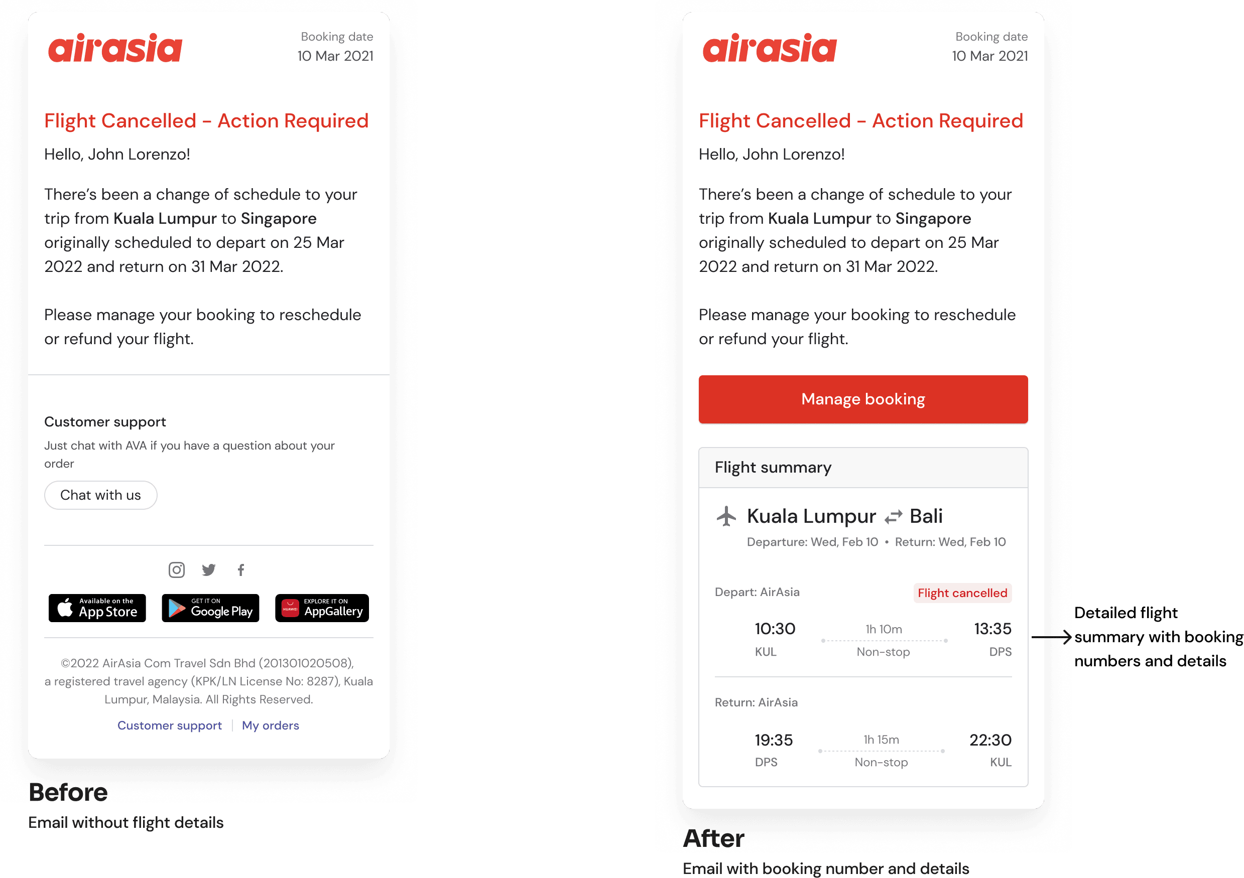
The email provided long text contains information but unreadable to users therefore they still as clueless of which flight that actually cancelled.
Therefore flight summary with booking numbers and booking details was provided to help users get clear information about their canceled flight
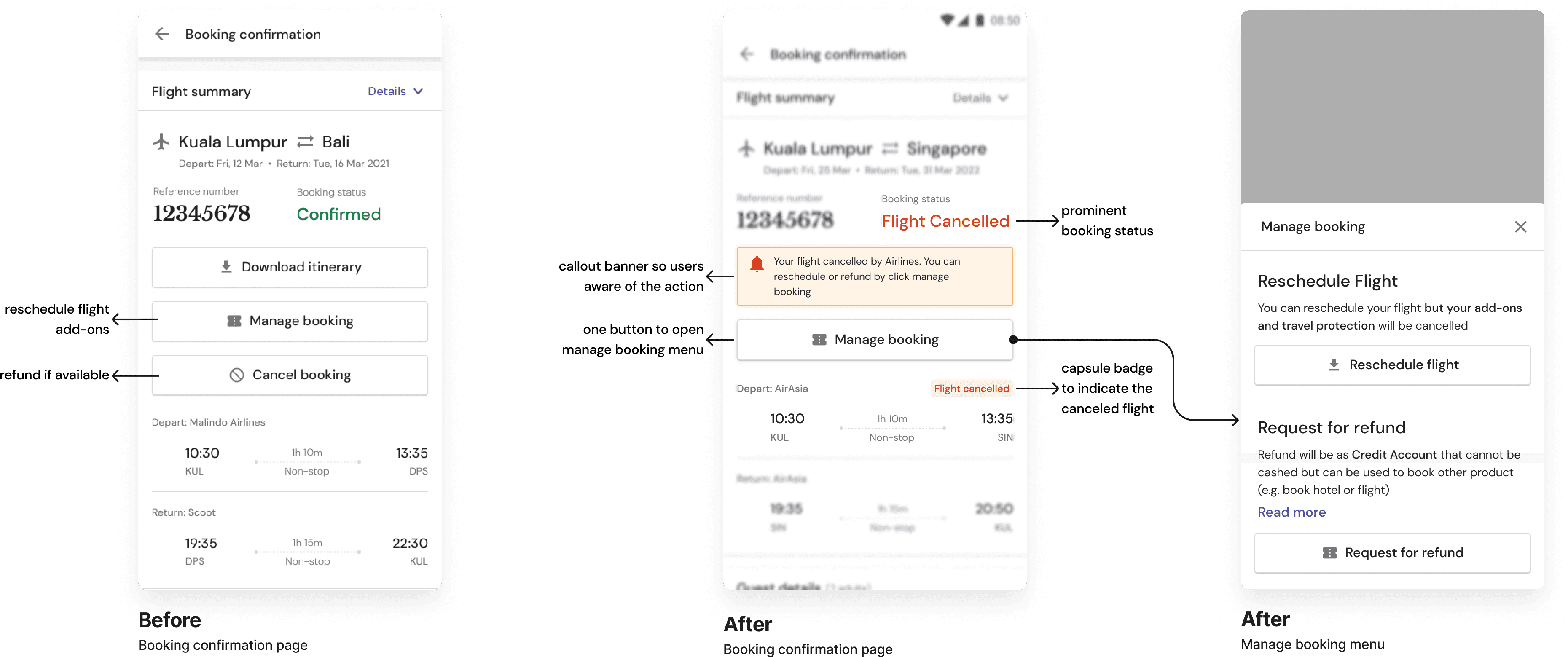
Canceled flight info on booking confirmation
Problem
No prominent indicator fo users to see when they flight got canceled
Action buttons not scalable since there are 3 buttons already
Solutions
Add yellow warning banner and new “Flight Canceled” booking status and red badge on canceled badge (the depart flight)
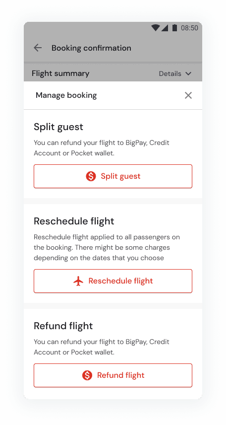
Add overlay menu for manage booking instead of display all the buttons at front. This menu also could prevent users to click wrong button by adding space with description for each menu
user feedback
Buttons are skipable
Buttons are easy to skip because of the grey color. Seeing button will prominent color will help user to see at a glance what action they can do.
Therefore we changed the button with secondary button instead of using tertiary since used the primary button would be too strong.
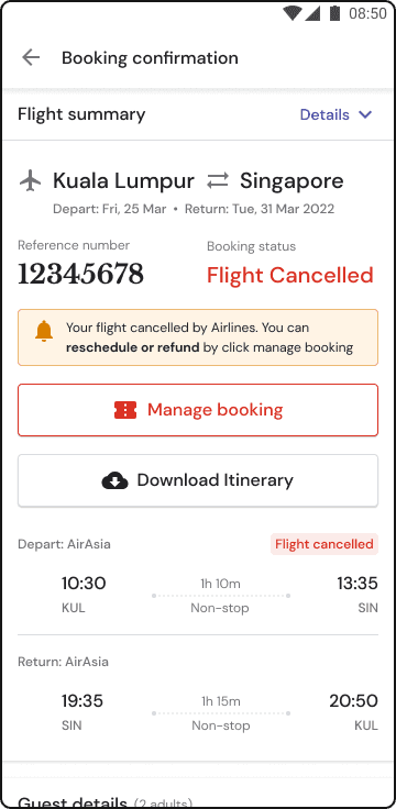

After
Before
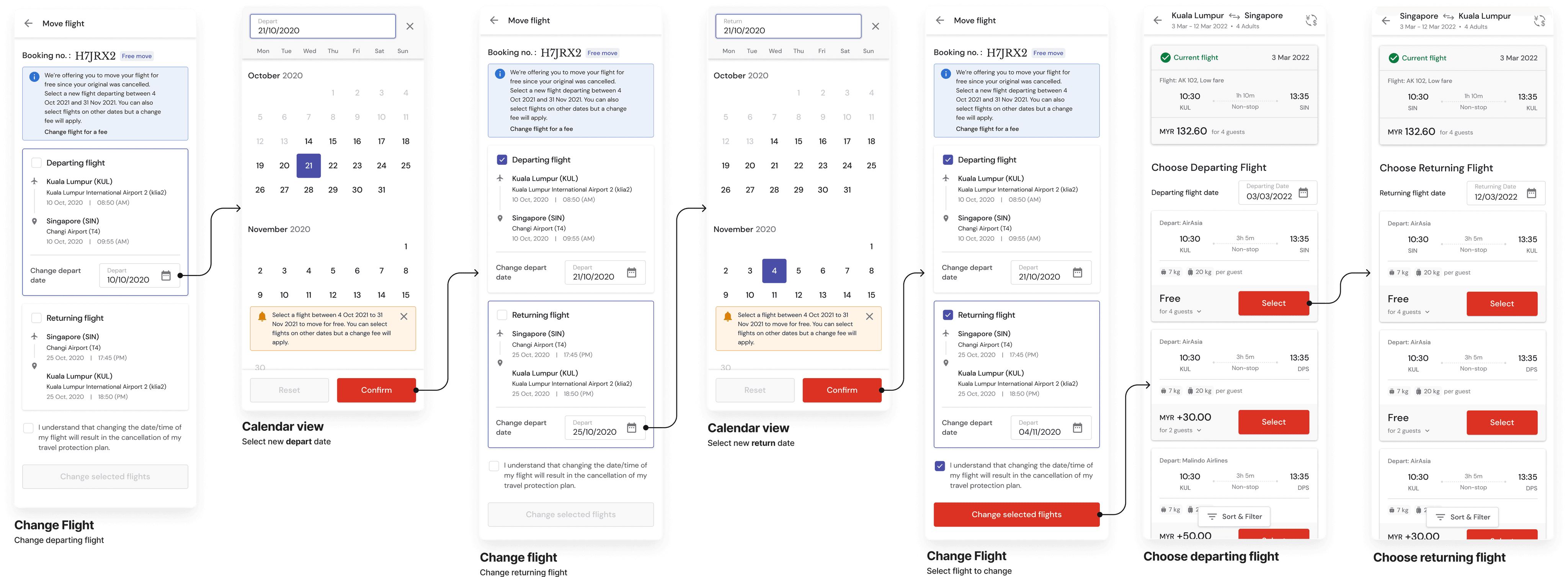
Simplified change flight flow
The previous design requires users to go back and forth if they want to change both of their flights. Not to mention that the page was ambiguous since it provided two entry point to change the flight date.
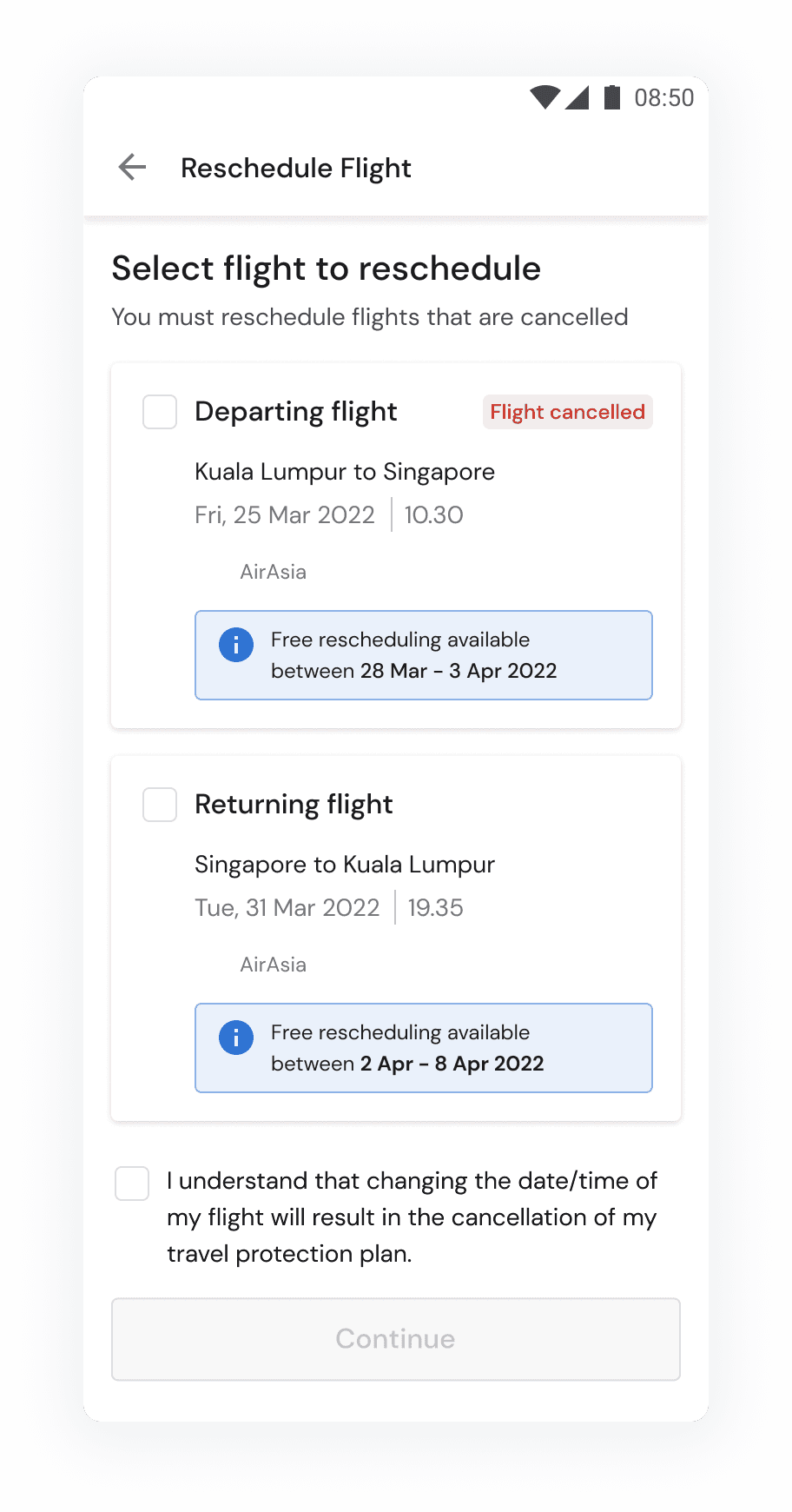
I simplify the flow to change by let the users choose the flights they want to change first, then let them change the date without going back and forth.
After
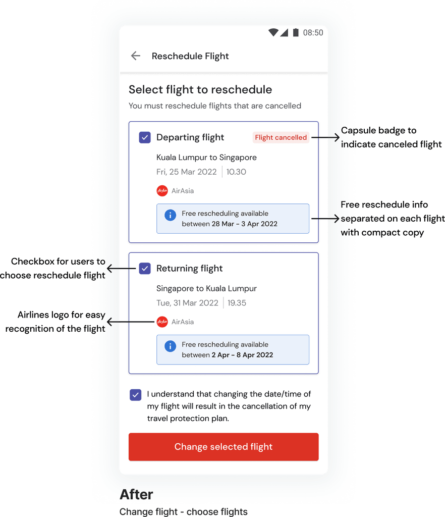

Before
Adjusted layout on resechedule flight page
I simplified the information on callout banner and put it into appropriate flight. Additionally, I moved the capsule badge to the canceled flight since users required to change the canceled flight.
After


Before
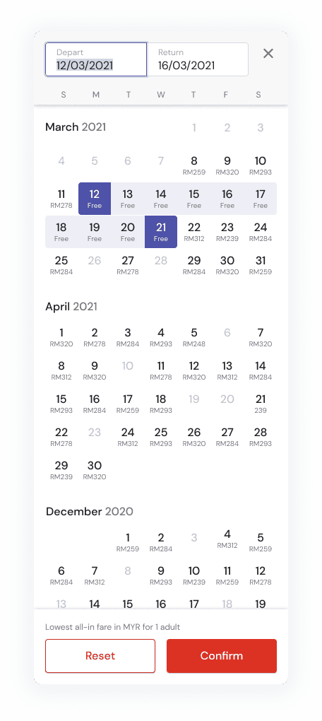
Provide free flight information and price on each date
The expectation was so users didn't have to memorized the free flights and know how much they have to pay for paid flight.
user feedback
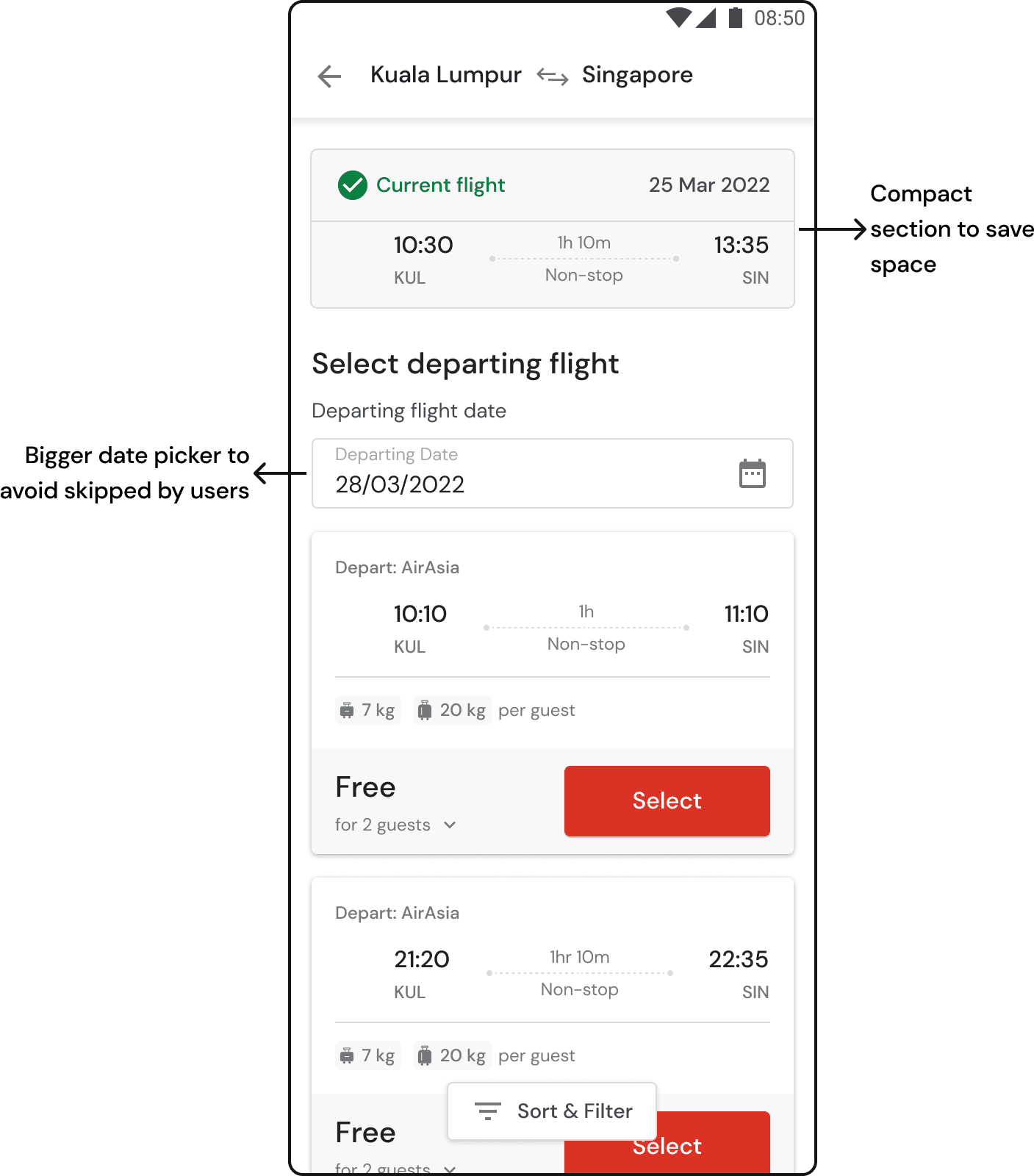
Date not so noticable
Date users already chose on previous page is not so noticeable. Therefore we make the date picker bigger so its more highlighted.
Some users needs the current flight section to compare with their new flight, but some think its not so important. Thats why I decided to make it more compact.

Refund details
The most important info users needed to know is the amount of money the will receive since it will influence their decision whether to refund or reschedule
Takeaways
Although it wasn’t reflected clearly on the portfolio, the real challenge of this project was on aligning with the stakeholders of the multiple teams collaborated. In order to align with different teams with different interests in remote setting I, as designer, had to proactively be the person who bring the team together, and able to find the middle ground. This process required me to continuously communicate the design and research process and result as early as possible.