Improve Seller Performance in Bukalapak
Bukalapak.com
2021
The seller performance monitor feature, originating from 2017, poses issues and had became obsolete.
Our goal is to enhance the scoring system and metrics, providing sellers with improved tools to monitor their performance effectively.
The data and confidential information in this case study has been altered to comply with non-disclosure agreement. All information in this case study is my own and does not necessarily reflect the views of Bukalapak.
My role
Desk research
Led co-creation process
Conceptualized design ideas
Add new variant on design system component
the team
1 designer
2 product managers
1 content strategist
1 data scientist
duration
2 Weeks
What is seller performance feature, and why is it important?
Bukalapak is one of Indonesian marketplace and just like any other marketplace in South East Asia, Bukalapak has its subscription service for sellers that offers various benefits for its sellers called Super Seller.
Super Seller came with badge as proof of credibility called Super Seller Badge. Those with commendable performance earn the Super Seller Badge, enhancing their credibility and, consequently, attracting more buyers to purchase their goods. and increased their transactions by 15%. And that performance are monitored in a feature called Seller Performance feature.
Seller Performance system sceme:

What went wrong?
To earn the badge, sellers required to get performance score minimum 75 points. On the other hand, the system is obsolete.
01.
Metrics were out of seller’s control
Metrics such as Number of Favorited Items and Customer were not in seller’s control. Thus, they cannot improve it.
02.
The scoring system lacked clarity
Users struggled to identify their strengths and areas for improvement, making it challenging for them to effectively utilize the metrics.

The goal is
Sellers to be well-informed about our scoring system and their performance metrics, empowering them to make improvements.
research
Parallel research
Before started the design I did parallel research with data scientist to double check the metrics drafted by product team aligned with what the users are needed
01.
Customer service report research
Data scientists evaluate customer service complaints from buyer regarding unreliability of sellers. The idea was to find what factors buyers thought made sellers unreliable. Some examples are numbers of refunded products, last online date and chat response rate.
02.
Desk research
I did the desk research on previous UX research reports to find buyers' opinion on what made a good seller.
We then combined both findings to make sure the metrics draft are aligned. The result were:
Remit rate
20
Paid to delivery (instant)
15
Paid to delivery (regular)
15
Chat response rate
20
Chat response time
20
KYC
10
TOTAL SCORE
100
design process - workshop
Co-Creation
We were given 2 weeks to work on this project which was not enough to do user research. Therefore, co-creation workshop was preferred to solve the problem.
This co-creation workshop was done to validate rules, evaluate the current design, define user segments and detailed user needs.
We gathered the whole team for workshop that separated into 4 sessions:
01.
Heuristic Evaluation
All participants were given time to evaluate, add questions and opinions, on the current design.
See details
02.
Value Proposition
We then compiled the HE result into value pain points and opportunities by using the value proposition method
See details
03.
Define user segments
All participants defined the type of sellers, what they were struggled at and what could we do to help them.
See details
04.
Roleplay
We divided the the team into three, asked them to act like the sellers and write down what will they do to achieve good score for each metrics.
See details
User segmentation
Based on the co-creation result, we decided to cover three types of users.
🥚
New sellers
new enthusiastic seller who are not yet super seller subscribers and wants to successfully sell their products
🐥
Mid-sized seller
Seller who already selling stuffs for quite some time, but still hasn’t acquire Super Seller badge
🪿
Big seller
Big seller whose revenue are huge, is a Super Seller and already acquire badge
design process - crafting
Jobs-to-be-done
After workshop, I arrange the findings into
user-flow and information architecture.
We then decided to solve these 5 JTBDs.
As a user I might don't know if there's a feature like seller performance
I added entry point with description on Seller's menu with "new" badge above the fold of Seller's menu to help all sellers to notice the feature. Additionally, for Super Seller user, I added entry point showing their performance status assuming they already familiar with the concept so it will help the sellers to see at a glance how their performance are.


As a user I want to know how it benefit me. Or why should I pay attention to this
One of the doubts we get was sellers didn’t know what is it for them. Therefore, I put the benefit to attract them before they use the feature.
As a user I want to know how it works
Showing them their performance from time to time and where they are right now
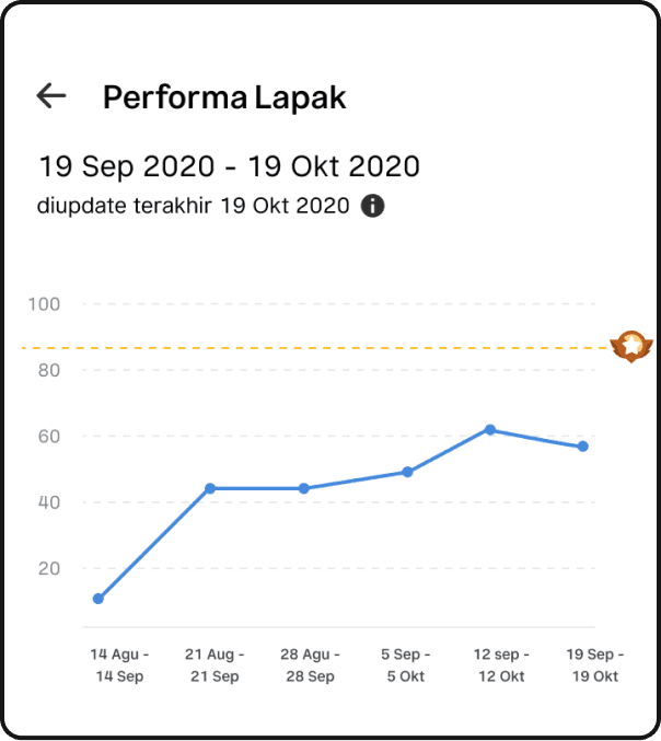
Exploration 1
Use graph so sellers can see their progress for the last few weeks
Inform users their progress for each week
hard to understand by sellers
threshold for Super Seller badge skippable
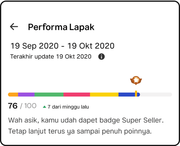
Exploration 2
Colorful progress bar that reflect the color of each metric.
Paragraph below progress bar to describe users current performance.
Show which metrics contributes to the main progress
Too many colors in one page can lead to confusion
Colors not represent how good the users are
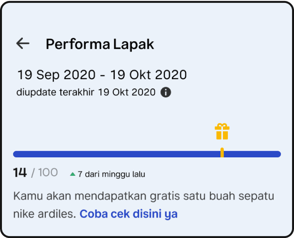
Exploration 3
Color on progress bar will be applied on the the background.
Color too prominent compared to whole page
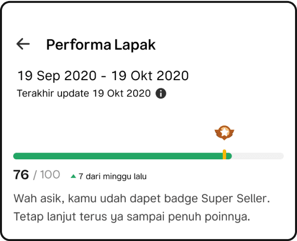
Exploration 4
Color indicates the status of seller’s score. Red for low, yellow for medium and green for good.
Paragraph below progress bar to describe users current performance.
Color coding easy to digest and notice at a glance
Users couldn’t define which metrics they lack at by only seeing this main progress

As a user I want to improve my performance so I will obtain the badge
Showing them their performance from time to time and where they are right now

Exploration 1
Status with motivational words
Action to follow
Tips for sellers to follow
The height is too much, it can only show two metrics at once
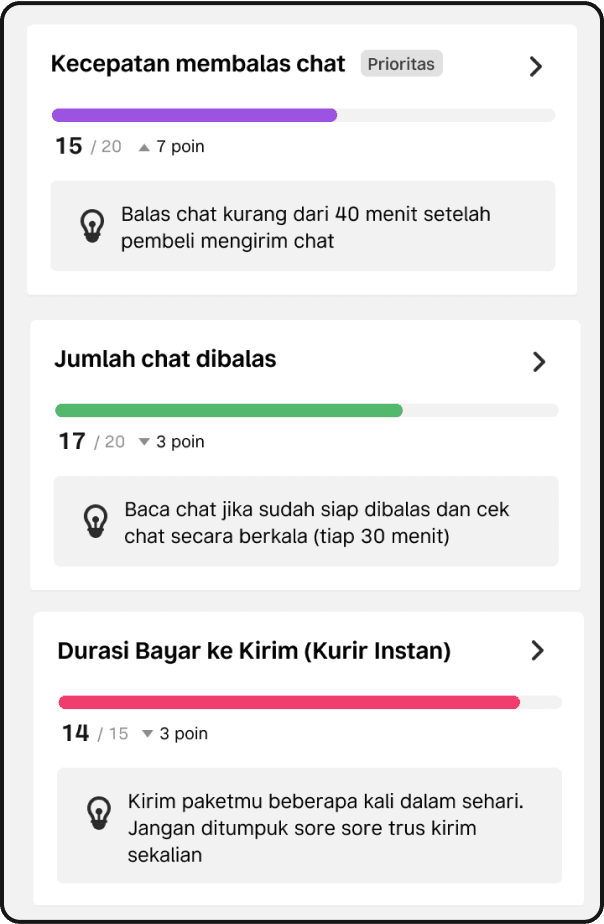
Exploration 2
Metrics with its own color
Priority label to show urgent metric
Tips for sellers to follow
Color could help sellers to see how much the portion of that metrics on overall performance
Tips wont help much when sellers already know about it
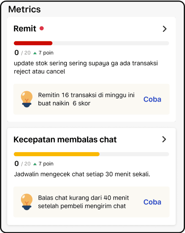
Exploration 4
Color coded progress bar. Red means low, yellow mid and green means good
Red dot indicator to show sellers the urgent metric
Action that they can do to increase their score
Sometimes sellers cannot follow the action since it depended on so many factors
Red dot looks like unread notification

Exploration 3
Round design to show progress
Priority label to show urgent metric
Tips for sellers to follow
Round progress easy to scan
Tips wont help much when sellers already know about it

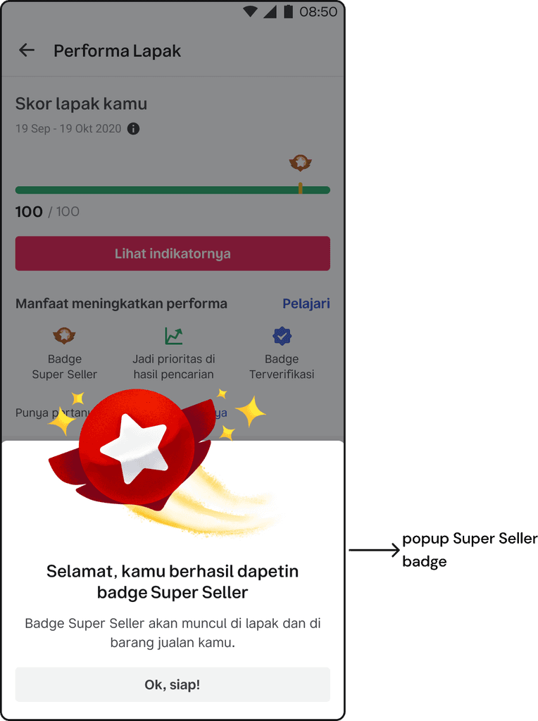
As a user I want to know when I got the badge
Showing them their performance from time to time and where they are right now
user testing
User testing result
We tested the concepts created above to several users and go the result below:
01.
Doable metrics
Compared to old one, sellers thought the new metrics easier to follow
02.
Easy to understand
Sellers understood easily about the concept and the red, yellow, green colors help them to define their current status
03.
Navigate seamlessly
Sellers could navigate the page smoothly. They knew which metrics they lacked at. They also helped to take action by reading the tips.
iteration
Iteration based on user testing result
Although the concept testing came out with positive notes, there were several improvement I did
Change size of main progress bar
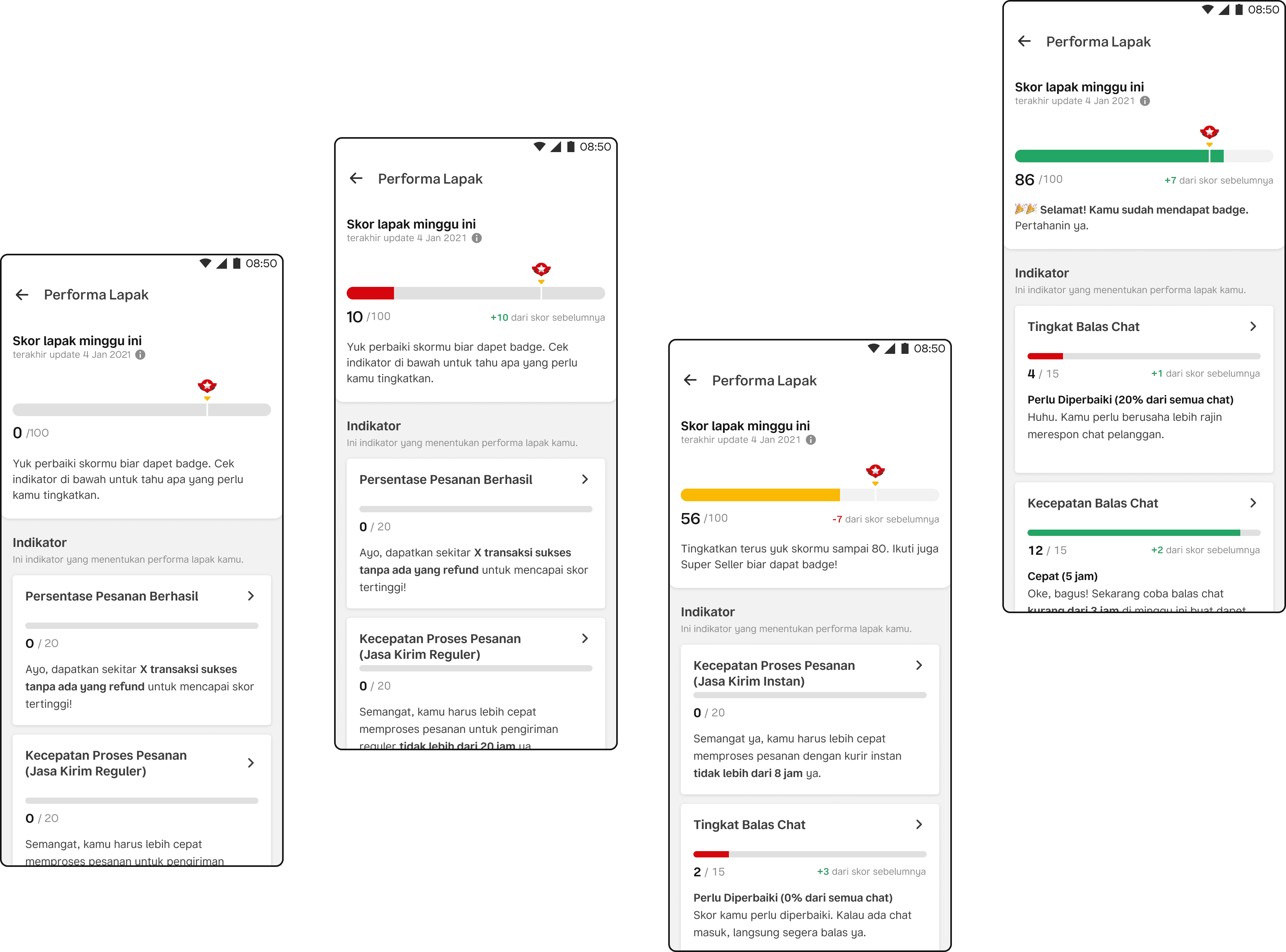
Made the main progress bar bigger to show prominence and the hierarchy of the information because visually this section below placed on the very top of the page as the main progress. Therefore, when users see the page, visually they can see that this progress bar is the overall performance and the smaller progress bar are the progress for each metrics.

Adjust metric card design
Changed the design on metric cards to reduce the height by combining the status and actionable tips since actionable tips will seldom contains vague action due to limitation on developments. I also simplified entry point to metric detail with assumption that users wont access the page that often since the information in that page are statics.

Add mechanism in showing information on the page
I sort the metrics from the least score so users dont have to scroll to find which metrics they have to improve. This will reduce effort from users and since the page that shown to them could be different every time they open the page they will know that their performance are actually dynamic depends on how they perform in weekly basis.
Enhanced metrics
Sort metrics from the least score
Dynamic tips depending on sellers’ store conditions
Improve progress bar on Design System Components
Bukalapak.com
2021
Why improvement important?
The progress bar component already existed in Bukalapak design system (Bazaar) but the component didn’t fit the design i worked on.
Therefore the first thing I did was propose the new design with reasoning why I designed it the first place and what I think needed to be improved from the existing component.
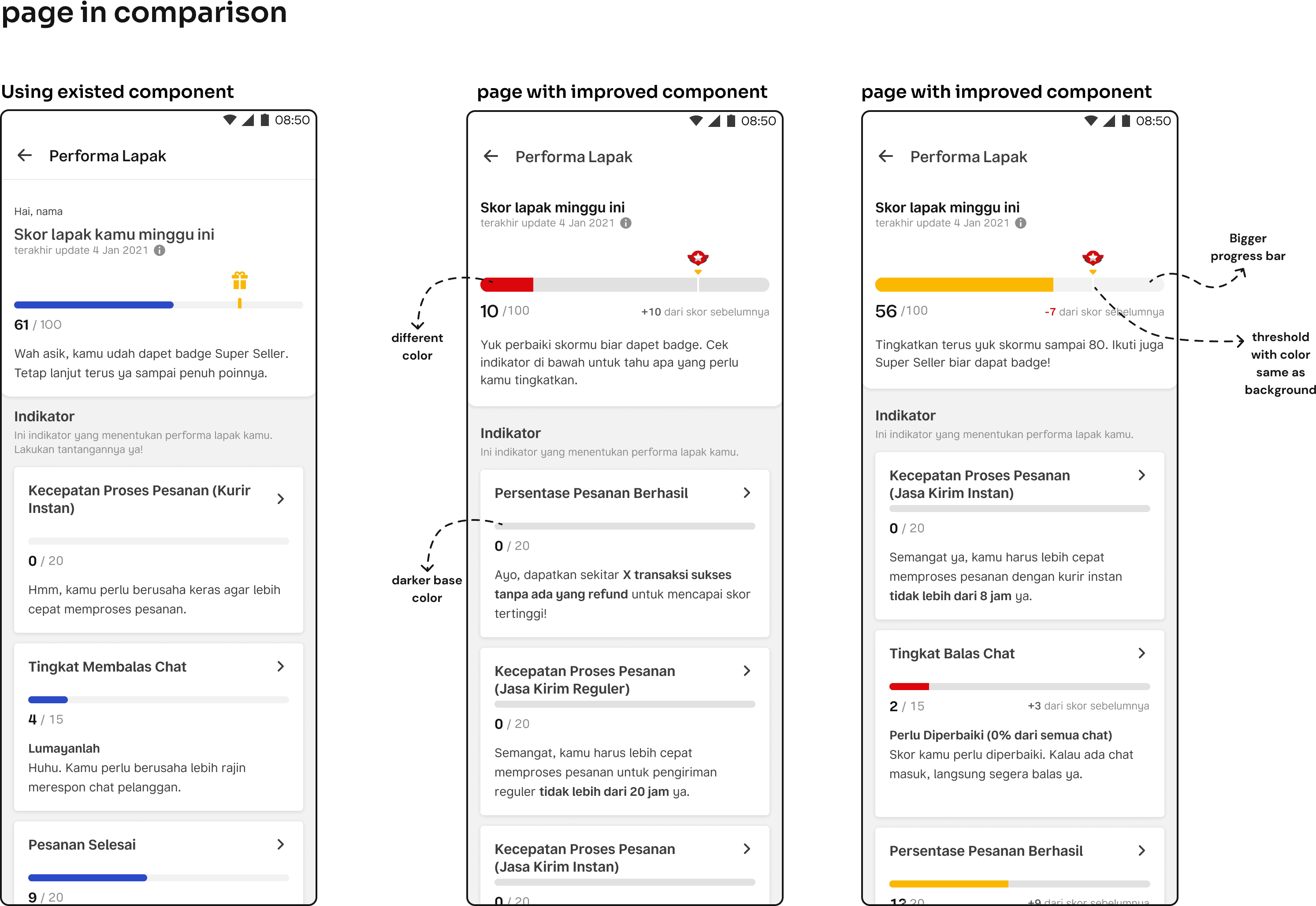
Proposal
There were 4 points I proposed to the design system team.
01.
Change base color into darker color
To increase contrast with the background color and increase the A11Y score
02.
Add bigger progress bar
Bigger progress bar probably only needed on my project at that time I worked on the project, but I decided to propose it and didn’t use the smaller one because I need to show users the main progress. Hence, I made it bigger.
03.
Variety of color
I needed to show sellers their progress and their status at the same time. Thus, I thought show color coded progress bar is an intuitive way to do it since sellers can see at a glance how good their performance is
04.
Change the threshold shape
Originally the threshold was yellow, but since I had to use the color yellow, we decided to explore another way to shoe the threshold

Proposal exploration
Color, threshold and incremental number
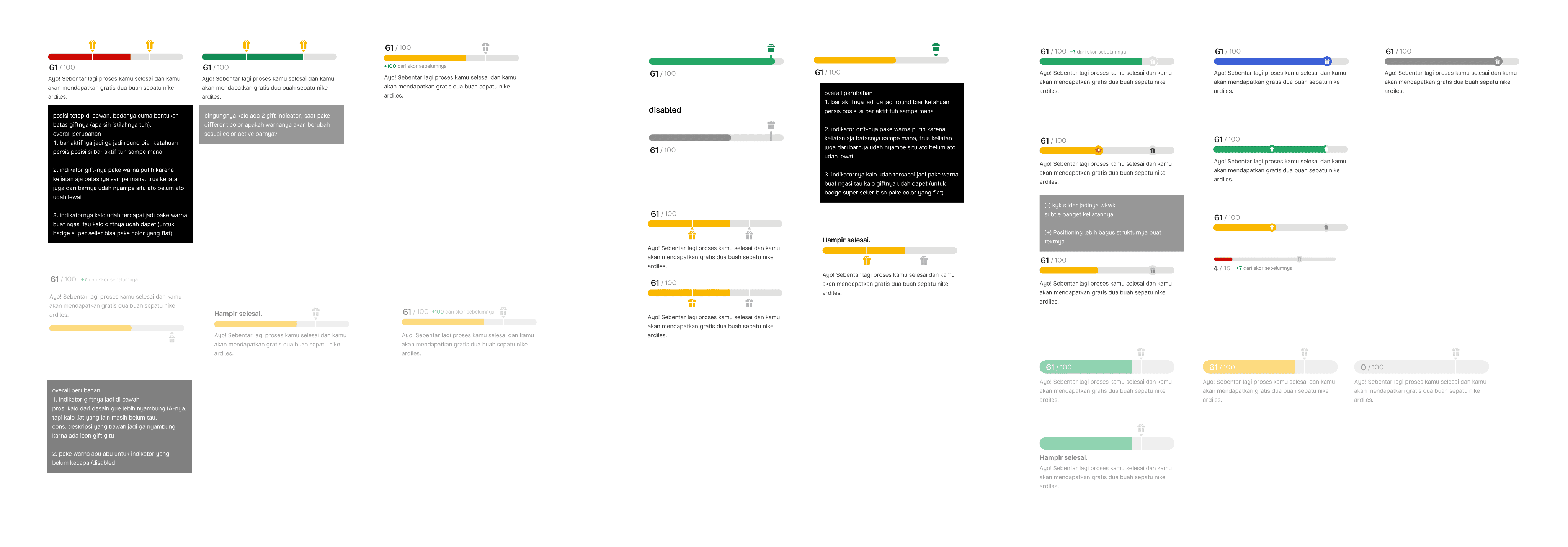
Proposal exploration
Threshold exploration
Final design
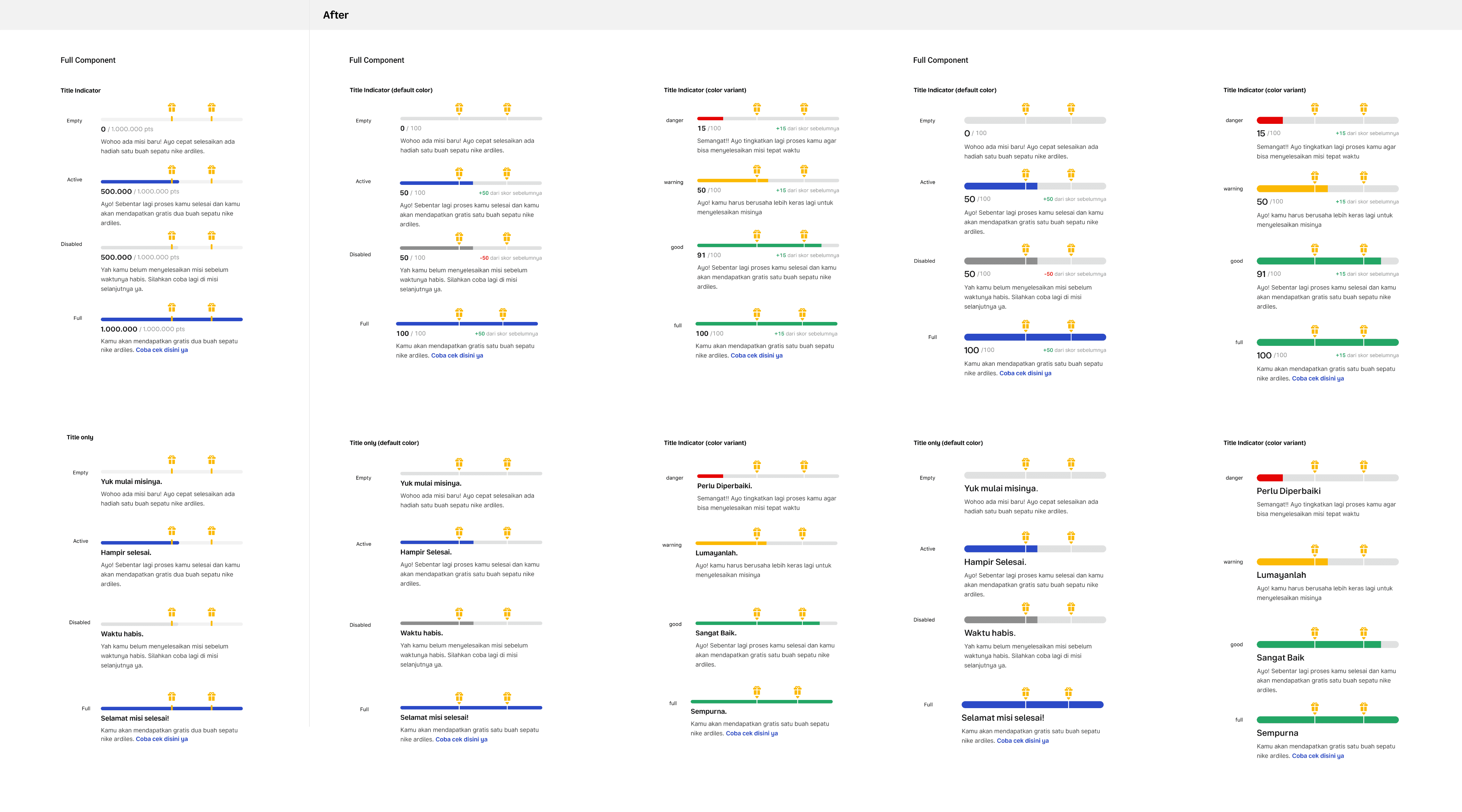
After several meetings and alignments with Bazaar team, we came up with the final design below.
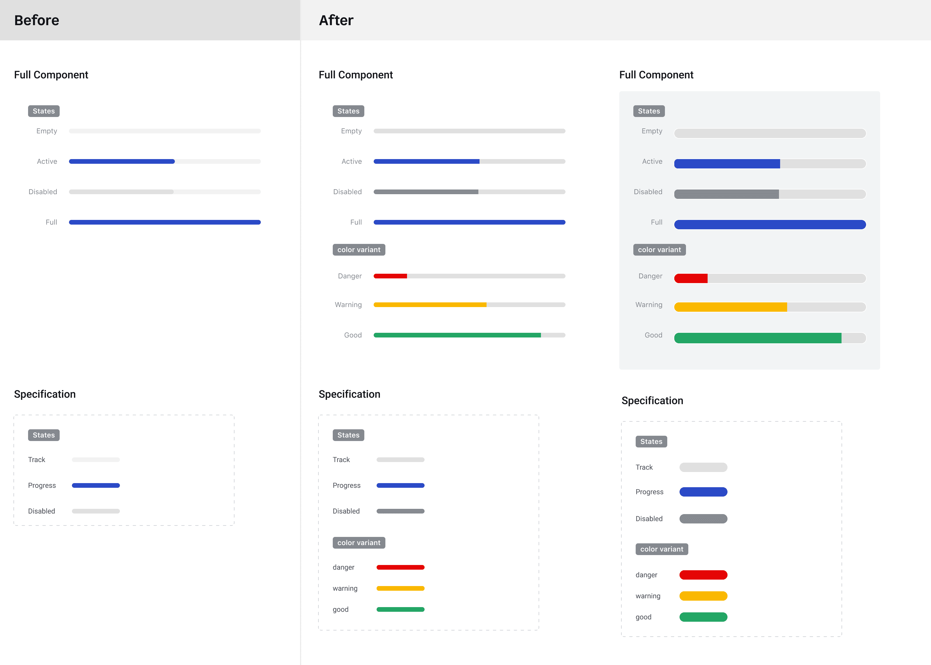
Improved progress bar component on Bazaar (Bukalapak Design System)

New proposed component with one threshold
